Case study:

Allowing existing creative assets to inspire the design


Project background


Challenge

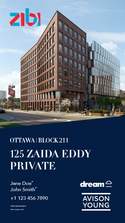
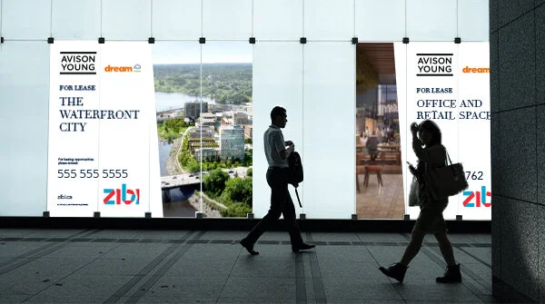
Marketing collateral was needed for a commercial listing in Toronto. Existing photography highlighting the property needed to be prominent on all materials. created. In addition, the building’s logo (its address) would also need to be included.

Solution

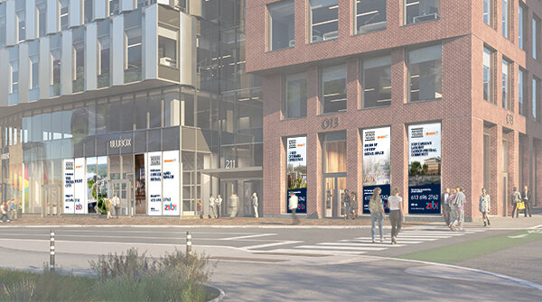
In order to achieve a cohesive look, the building’s logo was broken down into key elements. These elements were borrowed and expanded on to develop a guideline for designing additional creatives and materials.

Outcome

Design elements appeared modern and bold, when paired with the vivid photography. This striking contrasting created a lasting impression on all marketing collateral.


Case study:

Defining online presence — branding for digital


Project background


Challenge & Solution

A future commercial development in downtown Toronto was looking to expand its brand for digital application, as planning for social media and paid advertisements uncovered gaps in its existing guidelines.

Rather than depart from the existing brand, it was important that the development’s existing assets be used as inspiration. The development of the brand was taken as an opportunity to build awareness and enhance how the development was visually representing itself.

Outcome

The existing branding was expanded to develop brand themes that embodied the developments characteristics and messaging. These themes allowed the development to define and refine how it visually communicated its key messages to its target audience and on what platform. Additional guidelines were also developed for digital application.

Upon conclusion of the brand development, subsequent services were requested for execution of the development’s 360 marketing campaigns (social media, emails, web assets).


Case study:

Proposal for a modern rebrand — refining the past


Project background


Challenge & Solution

An office building in Toronto was looking to rebrand. It had previously been experimenting with it’s brand, resulting in competing visual identities. Instead of completely overhauling the building’s existing brand, its visual identities were refined and imagined as new logos that built on its past.

Outcome

Two potential logos were developed from existing visual identities. The original identities were simplified to focus on typography. By maintaining a sense of depth, the logos were still able to reference the original brand’s theme, “access”.

Additional options were developed that incorporated imagery of the property.


Case study:

A common social identity


Project background

Challenge & Solution

Social media assets needed to be developed for commercial real estate brokerage teams that they could share with their individual social networks. Since there was a high possibility of overlap between networks, multiple assets in a similar style needed to be created to prevent feeds from appearing repetitive and spamy.

Outcome

Different templates were developed that could be easily manipulated by teams for future use. The style was consistent with the company’s brand but applied differently between posts to avoid appearing too repetitive. This style was also applied to other social media posts, helping to unify and link the social presence of the company and individual teams.


Case study:

Marketing the largest zero-carbon emission community in Canada


Mary Anne is the sole graphic designer on the brokerage team working to market Canada’s most sustainable community. Materials were developed to help the project team engage with the brokerage community in Southern Ontario (Toronto, the Greater Toronto Area and Ottawa).


Project background

Challenges

Planning, designing and coordinating all necessary marketing assets was the top priority upon joining the project team, since the community redevelopment had been communicated internally and to external commercial real estate brokerages without prior preparations.

The project team consisted of multiple members from different offices and regions. Managing expectations, prioritizing tasks and communicating strategies was needed.

Solution

An educational campaign that aimed at communicating the unique selling points of the overall community was developed in lieu of a typical launch campaign that would’ve focused on the redevelopment’s commercial assets and availabilities.

To minimize the redevelopment’s rushed external introduction, all creative and content development was led by the redevelopment’s brand messaging and elements and had to follow best practices.

Outcome

The redevelopment was successfully communicated to the commercial real estate community. Email metrics for the educational campaign maintained industry averages throughout its entire run, despite regularly repurposing content.

By initially focusing on the overall community, the team was able to capitalize on external resources and media coverage at the time. This allowed more time for marketing assets to be planned and created.


Email marketing

Social media

The team was able to elevate their social media presence through the introduction of more modern and innovative mediums, such as video and Instagram.

The addition of music and movement in their social media posts helped to better communicate and express the “vibe” of the community and emphasize the redevelopment’s brand.


Additional marketing assets

Expanding on client materials to create property brochures, signage and formal responses (RFPs and RFIs) maintained the redevelopment’s visual identity and enabled content to easily be shared between assets.

An external translation company was hired to translate the property brochures into French. Reviews and edits were made to ensure consistency between existing client materials.


Case study:

Developing and organizing 100 pages of corporate information


Project background

Challenge & Solution

Corporate history, services and mission needed to be compiled into a single document for a company. Infographics were developed to help visualize key messages, while maintaining a constant look with the existing iconography library. A design grid was developed to help structure and organize the content. In addition to typographic hierarchy, the grid helped readers to identify different content types — sections, notes and quotes.

Outcome

A nearly 100-paged bespoke document was developed in collaboration with multiple departments. Later, when the company rebranded, key design elements and features, like infographics and the grid design, were incorporated into the redesign.


Case study:

Standardizing documents in Microsoft Word and PowerPoint


Project background

Challenge & Solution

Documents needed to be prepared in Microsoft Word and PowerPoint that could be edited by individual team members with limited experience with the software and design. There was also the potential for the template to be shared with a wider group and manipulated for other future projects/uses.

Solutions & Outcome

Templates were developed in Word and PowerPoint. Word templates emphasized developing a hierarchy within the text, while PowerPoint templates focused on breakdown information. Templates were designed to be easily edited by the user, while ensuring viewer engagement.


Case study:

Time to rejuvenate, recharge, and refine together as one


Project background

Challenge

A document needed to be created that could be shared (digitally and printed) with attendees for a company retreat. In the past, presentation-style documents were created that included similar content blocks. However, these documents focused on individual components of the retreat, like it’s location and amenities, rather than the company or overall experience.

Solution & Outcome

A brochure was created that included an itinerary and relevant information about the retreat. A company illustration was included on the front and back covers of the brochure as a continuous image. The illustration chosen was in keeping with the event’s theme. The tone of the event was emphasized with relevant stock photography. For the itinerary, the times were written and visualized with graphs that represented a 12-hour clock. This allowed guests to attendees to better grasp how their day was going to be divided.


Case study:

Developing property marketing collateral


Project background

Challenge & Solution

Marketing collateral was needed for a property in Toronto. A brochure, postcard mailers and social media posts were designed for the property. Due to limited resources, there was an emphasis on developing copy and sourcing relevant photography. Existing images were cropped, so that they could be repeated and speak to different messages without feeling repetitive.

Outcome

The video prepared for social media was later presented to the marketing teams in Ontario, Canada and across the global at Avison Young. It was recognized as an example of how to produce a video with limited resources and was shared as a base template for marketers and graphic designers to create their own videos with. In addition, the brand team at Avison Young will be using the video to develop additional global templates.


Case study:

Branding a known name


Project background

Challenges

A building in Toronto was planning to rebrand itself as NYC (an abbreviation of its name), with the completion of its renovations. How could the rebrand be implemented without being associated with New York City?

Solution

To separate the two NYC’s, a contrasting visual identity was established. Bright colours were used to contrast New York’s industrial architecture.

Outcome

Marketing assets were successfully created in a style that visually contrasted New York City. Bright colours form the building’s logo and bold statement headers where incorporated throughout.

To further emphasize the difference between the two locations, a short animation was created. The animation featured keywords used in discussions about the renovations, rebrand, and how the building would interact with its surroundings.